Hello, Zillow friends :)
I wanted to walk you through my high-level process for understanding customer goals by loosely using Volkswagen’s connected services.
Setting goals
Every design project starts with understanding the customer's needs and mapping those needs against business goals & objectives. In collaboration with the greater UX research team, I created journey maps to help all stakeholders understand the holistic phases that customers goes through. An added advantage to a journey map is being able to identify the moments of joy and frustration throughout those phases.

To ensure we are establishing the right value proposition, it is important to not only understand who are target customers are but also be able to empathize with them. In communicating our customer needs in a format that all stakeholders can relate to, I leverage persona’s.
Persona’s become an archetypal view of a customer. Model users that the we create to help understand the goals, motivations, and behaviors of the people who will use the interface. The persona represents behavior patterns, helping us understand the flow of the user’s day and how the interface will fit into it.
Persona One
Daniel Clark, 35-year-old married father of two, lives near Washington D.C., in a quiet suburb. Works at the Pentagon concentrating on Manpower issues within the Marine Core. He is well liked and has obtained many connections throughout the years with the Marines. He spends a lot of time talking to others in-person and on the phone. He prides himself in being supportive of all humans and is kind to everyone (we are all human). He is proud to be an American and being able to devote his time working helping the Marines solve issues that matter.
Web Experience
Prior to asking for data from one of his contacts Daniel has become accustomed to searching for information on the Internet. He typically uses the Internet about 2 hours a day at both work and home. He has a computer in his family room at home and his kids use it to play games. His wife uses it to pay the bills and do shopping. Because he relies on so much information to do his job he doesn’t have time to waste sifting through enormous amounts of copy. He needs small digestible chunks that are easy to understand.
Needs
Brief descriptions. He wants to be able to quickly scan headlines, topic areas to pick out the pieces that appear to be most important. If he finds a match he will look for more detail to ensure he is capturing the right information.
Clear factual information
Clear examples
Emotional Needs
Reassurance. It is important that the information he is gathering is coming from a reputable source since it will be passed along to others and his reputation is at stake.
Ease-of-use. He’s a busy man who doesn’t have time for inefficiency. He needs his resource to be a timesaving, no-nonsense partner.
Knowledge. He needs to know as much as possible to make informed decisions regarding the various manpower issues at hand.
Proven. He wants to know that the information he is obtaining has been proven and or tested. He doesn’t want to waste any time if his particular issue has been covered previously.
Site Goals
Find enough information or a person who can help to make decisions and move forward.
Offline Goal
Increase his knowledge and maintain his reputation as a problem solver.
Understanding customer needs
Design thinking requires us to understand real user needs and empathize with those needs. Leveraging a human-centric approach to gain empathy with our user's real needs allow us to cast our own assumptions and inherent biases aside.

Quantity - Cast a wide net to uncover scope
Quality - Bring the focus in to uncover subtle nuances and details
Patterns - Identify patterns and create categorizations
Archetypes - Formulate archetypes that align team members and stakeholders alike
Qualitative research efforts allow us to understand the subtle details around peoples intrinsic behaviors providing valuable insights into their situations, motivations, and desired outcomes.
Understanding the customer’s journey
Once we have a better understanding of who we are designing for, we need to identify the actions users take in order to achieve their goals and objectives. Journey maps are a great tool to visualize the processes that people go through and to understand the moments of joy and frustration they encounter along the way.

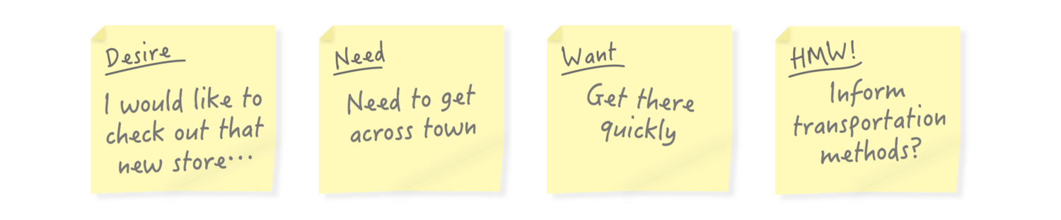
It’s extremely important to understand the scenarios your application is there to solve for and all the intricate pieces of data that will be captured and used during those scenarios.
Early on in the project, I created a visual to help team members understand all of the data elements holistically. With this understanding we could then map back to the journey maps and personas to establish key guiding principles around vehicle ownership, management and/or general use to design towards.

Validating the core user needs against new feature iterations proving that the principles defined are strong enough to account for the evolution of the app.


Data models
Data models can facilitate interaction among the designer, the applications programmer, and the end user. A well-developed data model can even foster improved understanding of the organization for which the database design is developed. In short, data models are a communication tool. Below is an example of a Data Model. To begin the definition part of a project, we initially create an exemplary data model to map out the possible content pieces that might need to be used within the interface.

Flow charts
The primary benefit of a flowchart is that it bridges the vocabulary gap that occurs between diverse groups that work together, such as between accountants and programmers. Both groups use specific jargon. A flowchart allows each to visualize a process, whether from the programmers' point of view or from the accountants' viewpoint.
Below, this flow diagram represents thoughts around the initial flow for receiving a notification and moving through app pieces to support finding participating service providers. Also an example of some initial thinking around repair maintenance and the ongoing management needed while using the app.


Sketching
Designing the user interface is a process. It all begins with an idea, but that idea needs user interface translation. Sketching allows you to visualize the screen-to-screen interaction so that your idea is something that’s visible and clear in user interface form. One of the biggest advantages to sketching is that it allows you to express your ideas quickly and involve others in creating the user experience.

Below, the sketch on the left is the base-level notification and then the right represents when pressed and the possible actions that could appear. These are: Learn More, Talk to a Technician, and Remind Me Later. The later could potentially be a number of different options or simply something that says "Remind me Tomorrow". This would allow the customer to ignore the message and receive it again via their control.

To work through the different scenarios and possible interaction areas, we created quick sketches to represent the different screens that would be needed to move through the app.
This is an example of the existing notifications screen. This is simply just a reference to see how the customer might use this screen to access a particular vehicle alert, versus relying on the notification directly.
This is an example of the vehicle alert detail screen. This screen provides details on the alert provided and description information to help inform the customer on how important it is and what they should do to possible remedy it.
This is example of the screen used to locate a potential service provider. This utilizes the map control and allows the customer to scroll around the map or enter specific search criteria. It is assumed the app would utilize the customers proximity to initiate the map view.
This is an example of the service provider details screen. This screen gives the customer the details surrounding the chosen service provider, including: Name, contact info, what services they offer and the option to make them your preferred provider for future uses.
This is an example of the scheduling screen. Here we see a calendar control that allows the customer the ability to choose the desired date and time slot. When there are dates / times that are not available they would be grayed out. This information would be pulled directly from the service provider.
This is an example of the scheduling confirmation screen. Once the customer chooses to make a reservation they will be taken to this repair confirmation screen. This screen provides details around the date and time they are to drop off the vehicle off. It also provides the ability to set a reminder on your mobile device (even though I am assuming a notification function will be part of the app itself - this was more of creating a reminder in your default calendaring app). There is also a mechanism to change the schedule if needed, which would return the customer to the previous screen.
This is an example of the "My Repairs" repair management screen. Here is where you can get access to any active or completed repairs made. This would become a main navigational area within the app itself and can be accessed by the main menu.
This is an example of the active repair. Here the customer can see the service provider details again and the status of their given repair.
This is an example of when the repair is complete. This screen provides the details on what the service provider did and if there is a charge and how much that charge will be. It also provides a mechanism to pay for the services rendered directly (this assumes there is payment capabilities associated with the given service provider built into the app itself).

Wireframe
A wireframe is a visual representation of a website showing:
Basic page layout
Structure
Navigational structure
Major components – web forms, sliders, advertising banners
It shows where design elements will go, although won’t show any finished design as we concentrate on the structure first. Wireframes help to focus the project and provide the most effective website which takes into account all our previous research.
Below, is an example of our "polished" wireframes, identifying various screens and states needed.

It’s one thing to design a product that is aesthetically pleasing, simple to use, and provides opportunities to delight your customers, however, it’s another to create an overarching product strategy that gives your product solution the best opportunity to reach potential customers, keep them engaged and get them to influence others, ultimately delivering on the defined value proposition.
Understanding stages of use
It is important to think about the entire landscape of your customers' journey and how all the different touch points throughout that journey impact their relationship with your product and the overall organization. With the insights gathered regarding the target users and the journeys they take we can map this against the stages of use.
Introduction Stage
The introduction stage is where the user learns about your product and decides whether the value proposition is inline what they are looking for.Growth Stage
The growth stage is where the prospective customer becomes a real customer. This is make-or-break time and extremely important to create an on boarding experience that is as frictionless as possible.Maturity Stage
The maturity stage is where you have an existing customer and your product offering is providing ongoing value. In order to keep this customer engaged you need to continually focus on their needs.Decline Stage
The decline stage is where a customer isn’t experiencing the direct value any longer. You need something to jump start that relationship again or run the risk of loosing them.
There is a lot to think about and it can be easy to lose sight of all the intricate pieces that go into a complete user experience. Mapping out customer journeys and aligning the business on the stages of use provide valuable insight into potential breakpoints and opportunities for failure.
Mapping your service offering
A product offering is more than just a single feature. Often the final solution provides access to a bunch of interrelated features and/or services. To determine how far your service offering should go, you need to prioritize features against the overall business value you want to bring to the market.
Mapping features into proactive and reactive categories is a method to align everyone on where the focus should be on your product or service and where pitfalls may exist.

Prototype
A prototype is a living, breathing exoskeleton for a website. It's interactive to the point that all elements can be navigated, manipulated and adjusted. The main reason behind taking the time to build an interactive prototype is simply having the ability to evaluate and work through usability issues. Since you are able to test UX in real time, you are able to see any issues that could arise or see what is missing from a page. It allows you to nail down the UX and content pollination so when we finally complete the prototype, we are confident that the user will experience the site exactly how we/the client thinks they should.
We know exactly what content will live on what page and what content will cross link between pages. We should have eliminated the prospect of surprises and set the framework to begin concentrating on design and how visuals will impact the site's visitors. It is also a HUGE asset for developers, they can see what needs to be built without any hesitation or questions.
Below, is an example of a prototype of that was created using the InVision app.

Visual presentation
The final design is visually digestible. At a quick glance, I can get information and make a decision about what I want to do next. I am a HUGE believer in goal-oriented design. I want the customer get the information he or she needs at a glance and make sure everything visible is relevant and useful.
When designing for use, you have to identify the intrinsic need that is required. You also have to balance “use” with outside factors like cultural characteristics, the environment, time, mode of use, and inherent biases.
In closing
Leveraging different ways of performing research early and often helps to ensure you are designing solutions with the right amount of insight and empathy.
Volkswagen had over 35k clicks to schedule service via the app and the online site had 5k showing that the trend is moving towards the app based service model. Increasing the total revenue by over 300k.
When it comes to individual tactics it's important to use a balance of quantitative and qualitative methods. Leverage quantitative analysis methods, including surveys, questionnaires to understand the scope of the given problem space and to understand the data around what customers do and want.
Leverage qualitative exploratory methods in the form of interviews and ethnographic studies to gain valuable insight into the "Why" and "How" of what our customers do, how they live, how they use things, and what they need.
“An interface is humane if it is responsive to human needs and considerate of human frailties.”
— Jef Raskin


